Tuva Tools v2.8.0
Released 11/1/2020
The work for 2.8.0 includes a range of features, fixes, and updates. We worked on improving the color contrast of the cases by changing from a teal color to a blue color. We also added contextual feedback to help users create their plot. We then enhanced the plotting area by adding a completely new Y2-axis that will allow people to compare attributes of varying magnitudes. Finally, we also spent some time fixing specific graph issues with the Data Tools.
Changed:
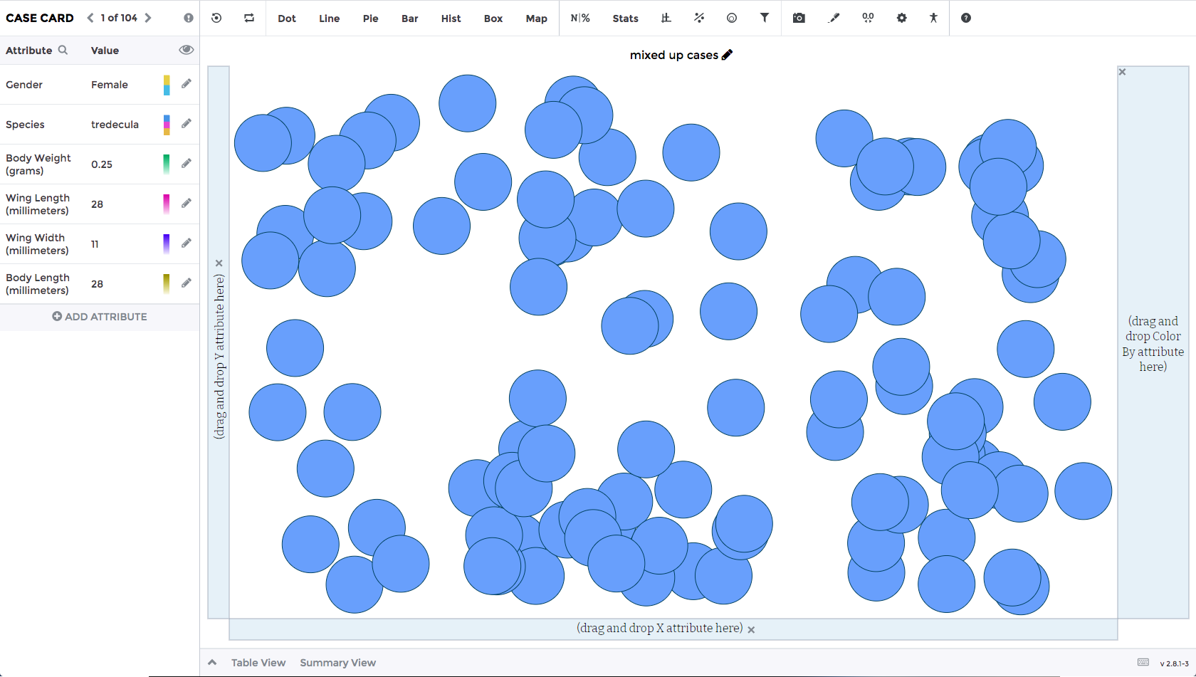
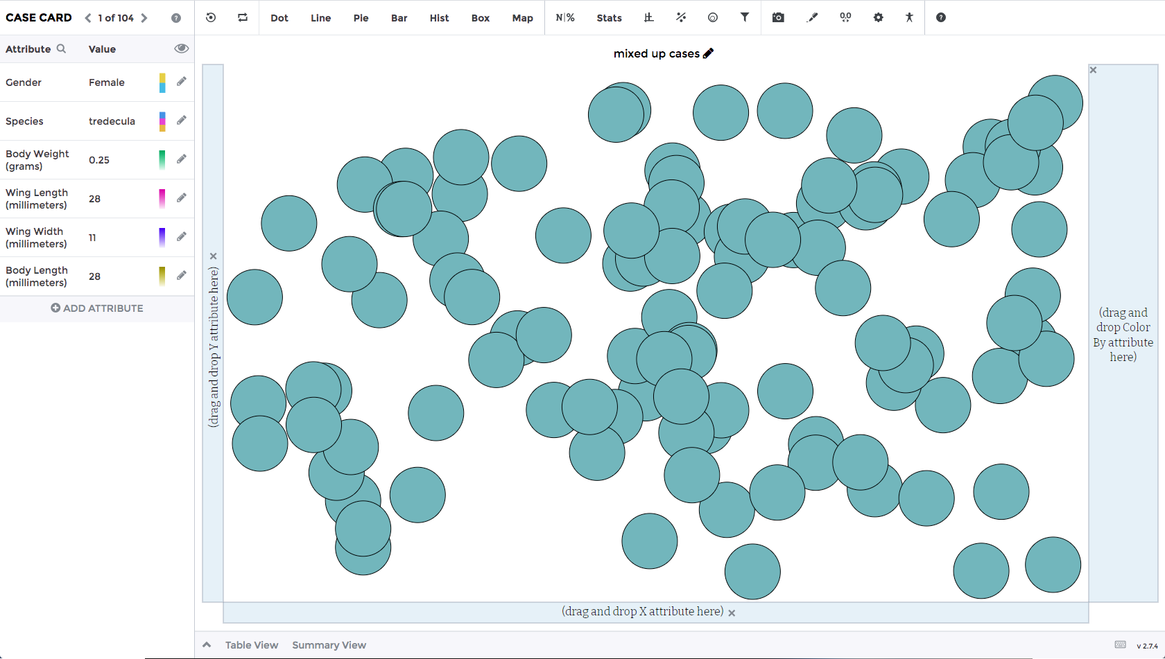
- Case Color Change: We changed the case colors from teal on white to blue on white. The reason we made this change is the teal on white did not meet the color contrast standards set by WCAG. Additionally, since we had gone in and updated the different cards, toolbar, and the general look and feel of the Data Tool to ensure color contrast standards and to make it look cleaner, we also wanted to do a visual refresh for the case colors too.
Added:
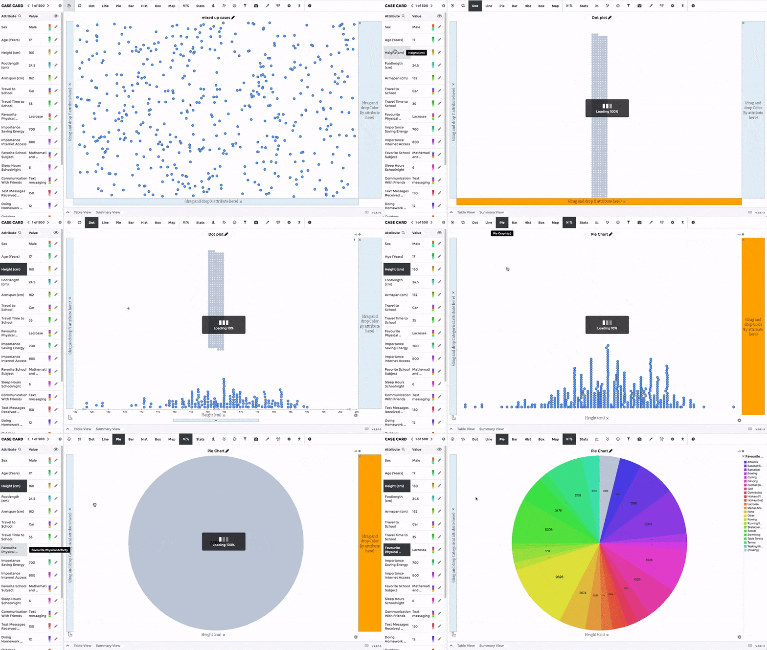
- Smart Axis Labels: This feature will give users contextual visual feedback to nudge them along when creating a graph. The visual feedback presented to the user is turning an axis orange and turning the case colors to grey so the plot the user is trying to construct looks incomplete. We're hoping this will help users notice they need to take another action to create a valid graph. Keep in mind, there are many valid graphs a user can create, but not all valid graphs are meaningful. This feature currently applies to following plot types: line graph, pie graph, box plot, and histogram. See the GIF below for a demo.
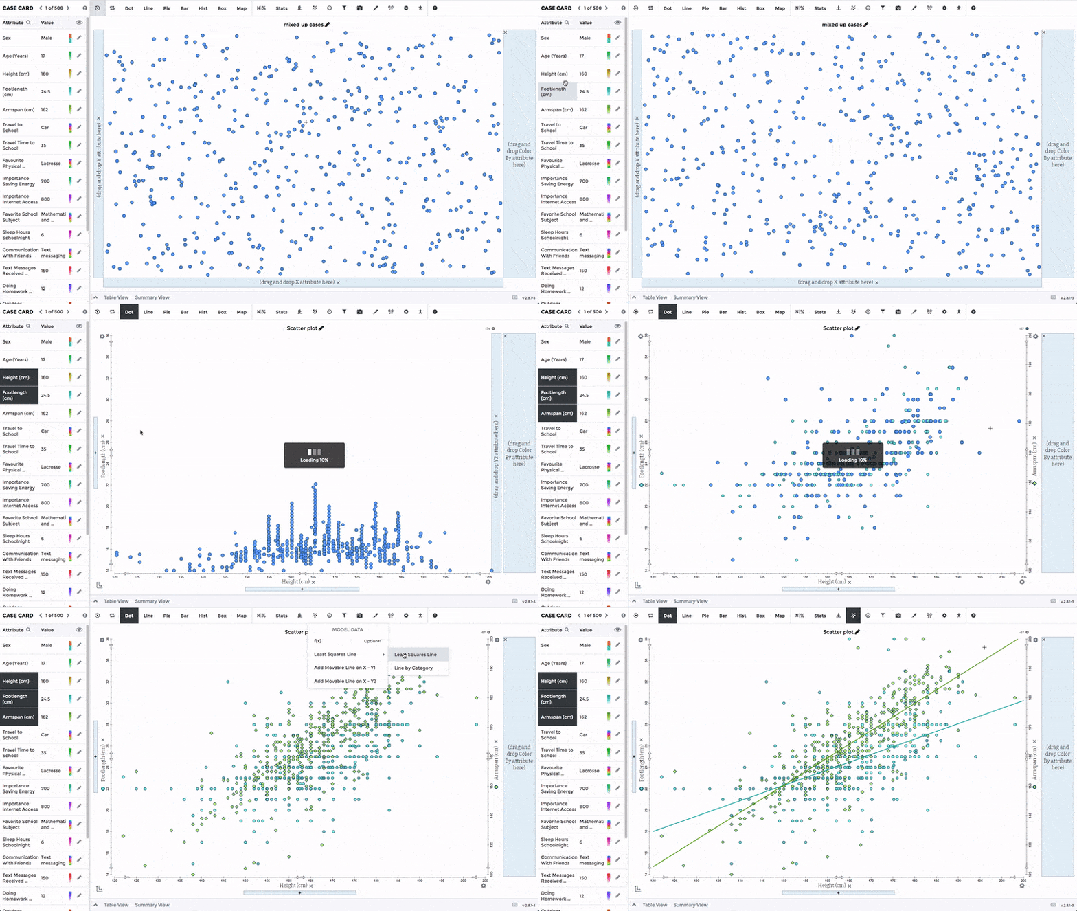
- Dual Y-Axis: We've added a feature to allow teachers and students to create a graph with two Y-axes. One on the left (Y1) and one on the right (Y2) of the plot. This feature will allow people to display two numerical attributes of varying magnitudes in the same graphing area. To use this feature, you will need to enable it in the settings panel. See the GIF below for a demo.
Bug Fixes:
- Histogram: We fixed an issue for histograms when interacting with a set of samples. In the sampling table, we noticed that changing between samples increases the number of histogram bins every time you click to a new sample.
- Boxplot: Based on feedback we received about our boxplot algorithm, the quartile calculations for our boxplots were a little different than other software like Excel and other quartile/quantile/percentile functions. We've updated our boxplot algorithm so it will generate the same output as the formulas available in Excel and other software.
- Dividers: We fixed an issue with the dividers double counting cases when they were lying immediately on the divider.