Tuva Tools v2.7.0
Released 9/17/2020
The main focus for v2.7.0 has been adding features and changing existing features to make the Tuva Data Tools compliant with the Web Content Accessibility Guidelines. This accessibility work was started in v2.3.0 by increasing the color contrast of many of the visual elements and adding ARIA labels to many interactive components. We're proud to continue this work to ensure the Tuva Data Tools are accessible to every student and teacher that wants to analyze data.
Changed:
- Management for Color Contrast and Design Styles: We've changed the way we're handling design variables across the Data Tools. Our effort here was to make it easier for us to manage all the different styles, colors, and user interface elements across the different components of the Data Tools. This effort, while it may not be noticeable while interacting with the Data Tools, will help us in the long run to quickly add new Color Contrasts.
- Color Contrast: For a while after we released v2.3.0, we disabled all color contrast options: reverse contrast, black on rose, and yellow on blue. We've now reintroduced the reverse contrast color style because the work with reorganizing the management of design styles allowed us to quickly reimplement this color contrast style.
- Plotting Area Tooltips: We've changed the way the tooltips appear in the plotting area to ensure they match the same styles of the tooltips that appear across the toolbar menu and different cards.
-
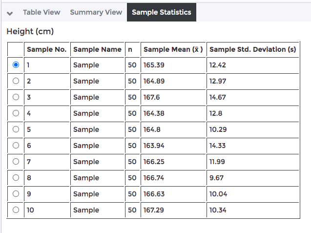
Sampling Radio Buttons: To ensure
the samples generated by the sampling feature are
navigable by keyboard we added them to the tab
index. Once a user has focus on one of the radio
buttons of a sample, they can then navigate the
entire group of samples by using the arrow keys on
their keyboard.
- Rendering Math Equations and Related Text: We've updated the software for a number of areas in the plotting area, summary view, table view, toolbar menu, and different cards to ensure that math equations, chemical formulas, and other related text will render properly.
Added:
- ARIA Labels:
-
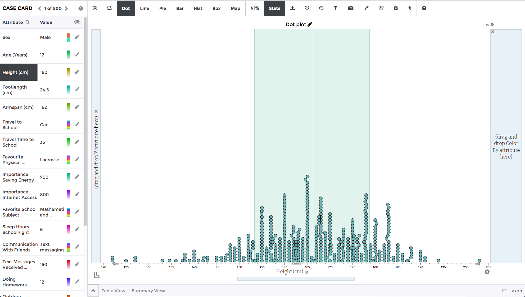
Dynamic Plot Description: We've
added a dynamically generated description of the
plot. It describes the attributes on the X-axis,
Y-axis, and Legend. It will also explain the
type of plot that has been created, whether it's
a Dot plot, Scatter plot, Line graph, etc. For
users to hear the plot description, they have to
turn on their text-to-speech software and shift
their keyboard focus to the plotting area. This
feature is in ongoing development and there will
be future enhancements made to it.
-
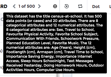
Dynamic Dataset Description:
We've developed a dataset description that
summarizes what the dataset contains - it's
attributes and number of cases - as an ARIA
label. This is intended to help people with
visual disabilities to quickly get a summary of
the dataset. This information is also available
for sighted individuals as a tooltip when they
hover over the information icon in the top right
of the Case Card.
- ARIA Labels for Individual Cases: We added ARIA labels for individual cases based on the tooltip information. This will allow users that use text-to-speech software to hear the information that each case refers to while they navigate the plotting area. The plots that currently support these ARIA labels include: Dot, Scatter, Line, Bar Chart of Values, Box Plot with Outliers, Box and Dot Plot, Map, and Histogram. This feature is in ongoing development and there will be future enhancements made to it.
- Toolbar Menu and Cards: We've gone through and added ARIA labels for all the elements across the different cards and toolbar menus. This will allow someone that's using their text-to-speech software to hear where they currently have keyboard focus.
- Keyboard Navigation:
-
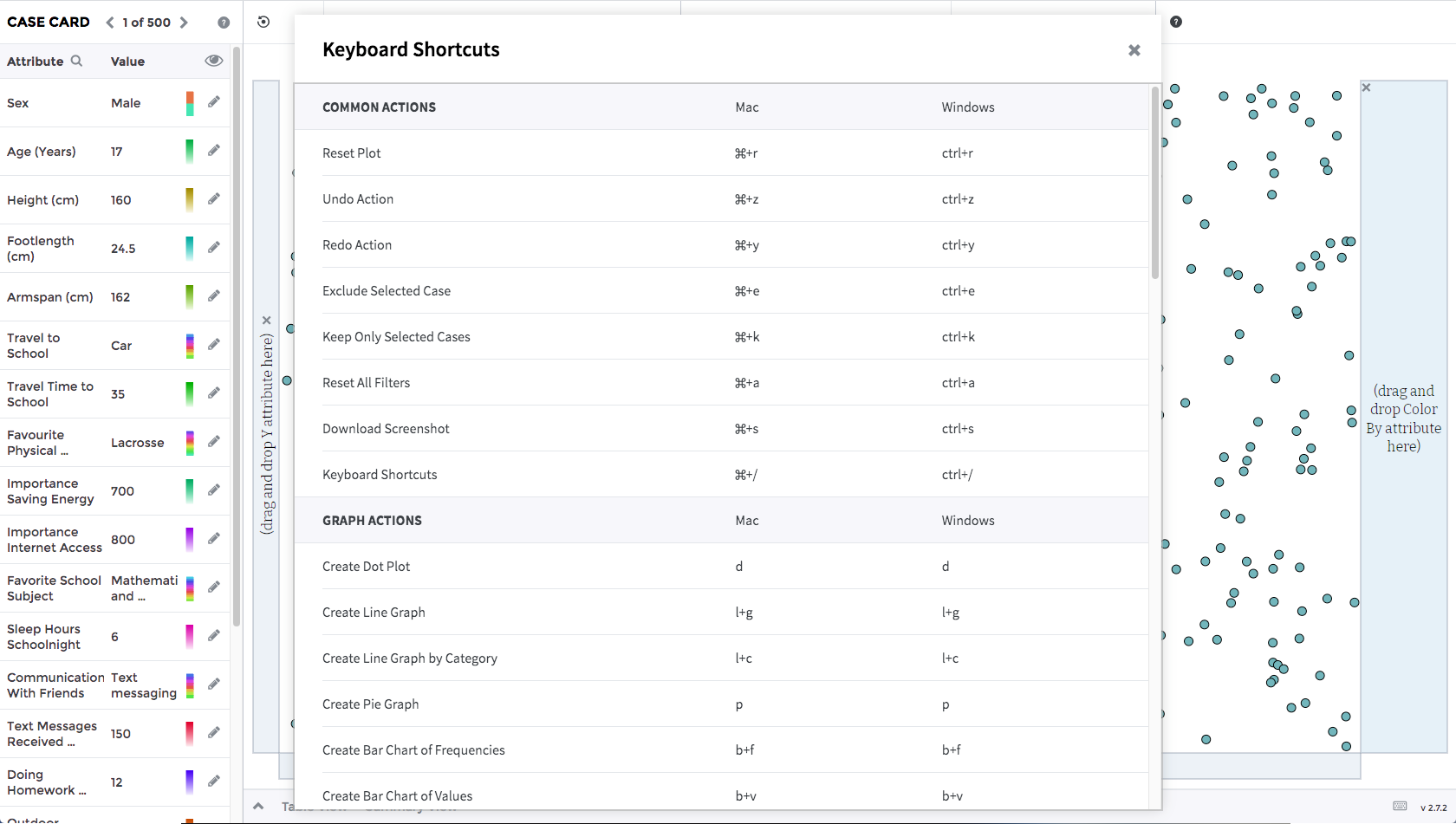
Keyboard Shortcuts: We've added
keyboard shortcuts to allow users with and
without special needs to effectively manipulate
data and analyze it with only their keyboard in
a logical and intuitive way. We've taken the
most common actions and mapped them to different
key combinations. These actions and key
combinations are available to view via a pop-up
under the help menu or via the keyboard icon in
the bottom right of the Data Tools.
- Plotting Area Keyboard Navigation: We've enhanced the plotting area to accept keyboard inputs. This opens up the plotting area to keyboard navigation allowing users to intuitively navigate the different plot types. Users can press tab to cycle through the cases. For the majority of the plot types the cases will gain focus from left to right. This feature is in ongoing development and there will be future enhancements made to it.
-
Sonification (in beta): We've been
working on a proof of concept to create an auditory
representation of the visual data shown on screen.
While we have released a beta version and we're
going to continue enhancing it, this feature will
help people with visual challenges and disabilities
to listen to their data. We're still planning to do
some more research around the sounds that should be
played and how we want to represent visual data as
auditory output. The current sound effects and tunes
the user will hear are expected to change in the not
so distant future.
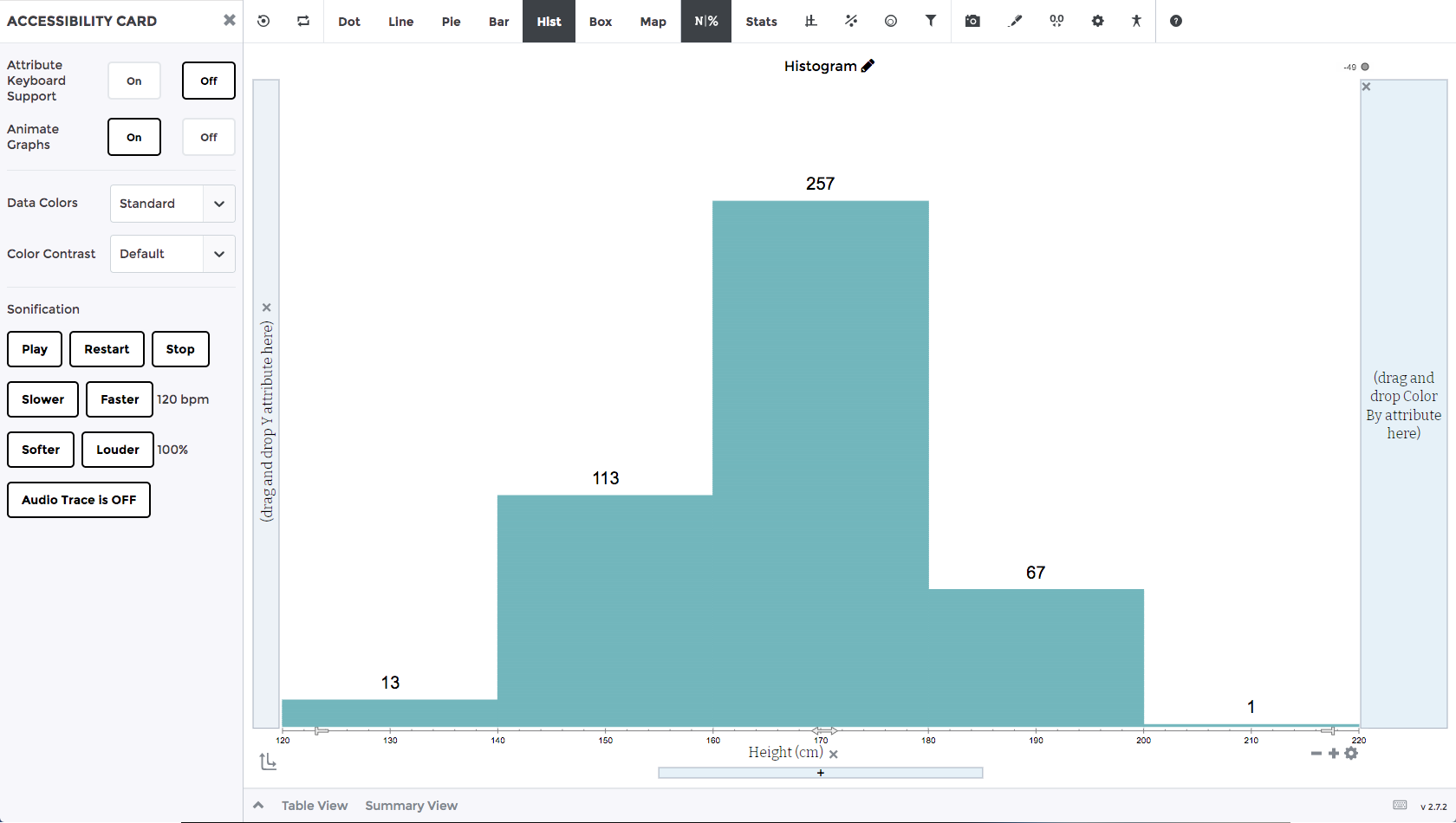
- Axis Level Settings Button: We've added an axis level settings button that will open the settings card. This will allow users to make axis specific adjustments like changing the min and max ranges of the axis in the plotting area.
Bug Fixes:
- After adding the axis level settings button, we noticed the remove button and the settings button were overlapping. We fixed this issue to prevent them from overlapping.
- We fixed a bug when saving a plot when cases with missing data had been filtered out of the plot. The bug caused these cases with missing data to reappear in the plot even though they were filtered out after loading the plot state.
- We fixed an issue with the background opacity of the Legend when viewed on top of the map plot to ensure the text is readable.
- We fixed a few minor issues affecting the alignment of the drop areas for the X-axis, Y-axis, and Legend.
- We fixed an issue with the decimal precision buttons available in the summary view. They were overlapping with the summary view text on small screens. They now have their own dedicated space so they will no longer overlap.
- We fixed an issue for the glow drop shadow that appears on the different drop areas while hovering an attribute over the drop area. A small bit of the drop shadow was getting cut off. We've adjusted the area so it's no longer getting cut off.
- We fixed an issue with the color picker going off the screen when it was opening for the last item on screen.
- We found and fixed a keyboard trap for the attribute formula field.